Journal ·
Personal Color Basics: How to Find the Colors That Suit Your Face
Warm vs. cool, the four seasons, why lighting changes everything, and how AUBE EDIT's free LOOK gives you a first read on your colors. A complete primer on personal color.

A lipstick that looked perfect in the store feels strangely off at home. A coat that looks great on a friend makes you look tired. It isn't your taste, and it isn't your eye. Most of the time it's about how a color works with your face, which is what personal color describes.
In this guide we'll cover what personal color actually is, how to read warm vs. cool and the four seasons, and why a single photo can't settle the answer. At the end, we'll show how to get a first read on your colors with AUBE EDIT.
What is personal color?
Personal color is the range of colors that harmonize with the natural tones of your skin, eyes, and hair. Hold a flattering color near your face and your skin looks clearer, your eyes brighter, and shadows softer. An unflattering one can emphasize under-eye shadows or redness and make you look dull or tired.
Personal color isn't a rule that you may only wear certain colors. It's closer to knowing the direction that supports your face best. Once you know the direction, shopping gets easier and regret purchases get rarer.
Personal color is less an answer key and more a map for your face.
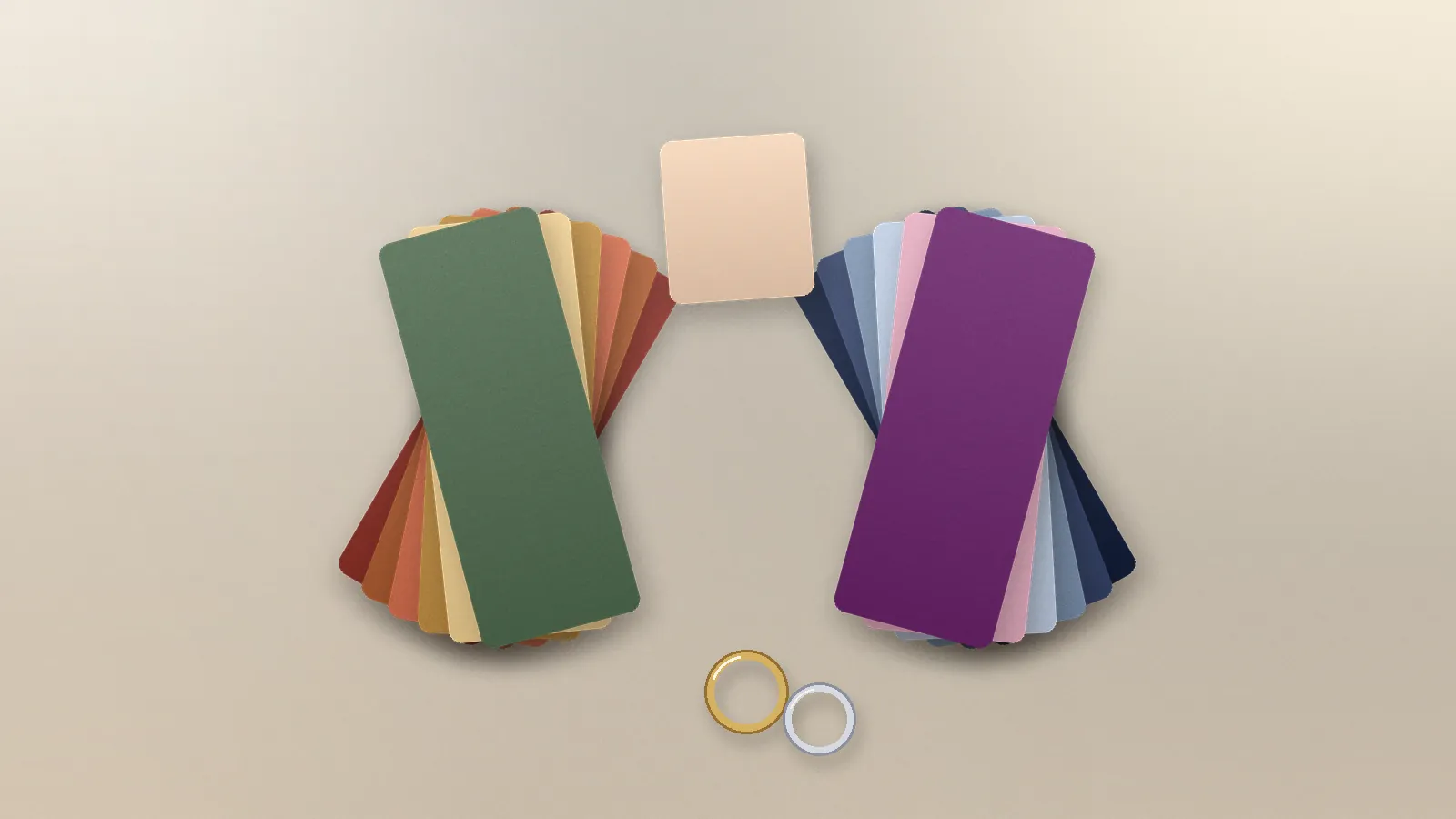
Warm vs. cool, and the three ways to read a color
Warm and cool tones come up first, but temperature alone doesn't tell the whole story. Colors are usually read on three axes together:
- Temperature (undertone): whether yellow-leaning warm colors or blue-leaning cool colors feel more at ease
- Value: whether light, airy colors lift your face or deeper colors give it definition
- Chroma: whether clear, vivid colors bring you to life or soft, muted ones look more natural
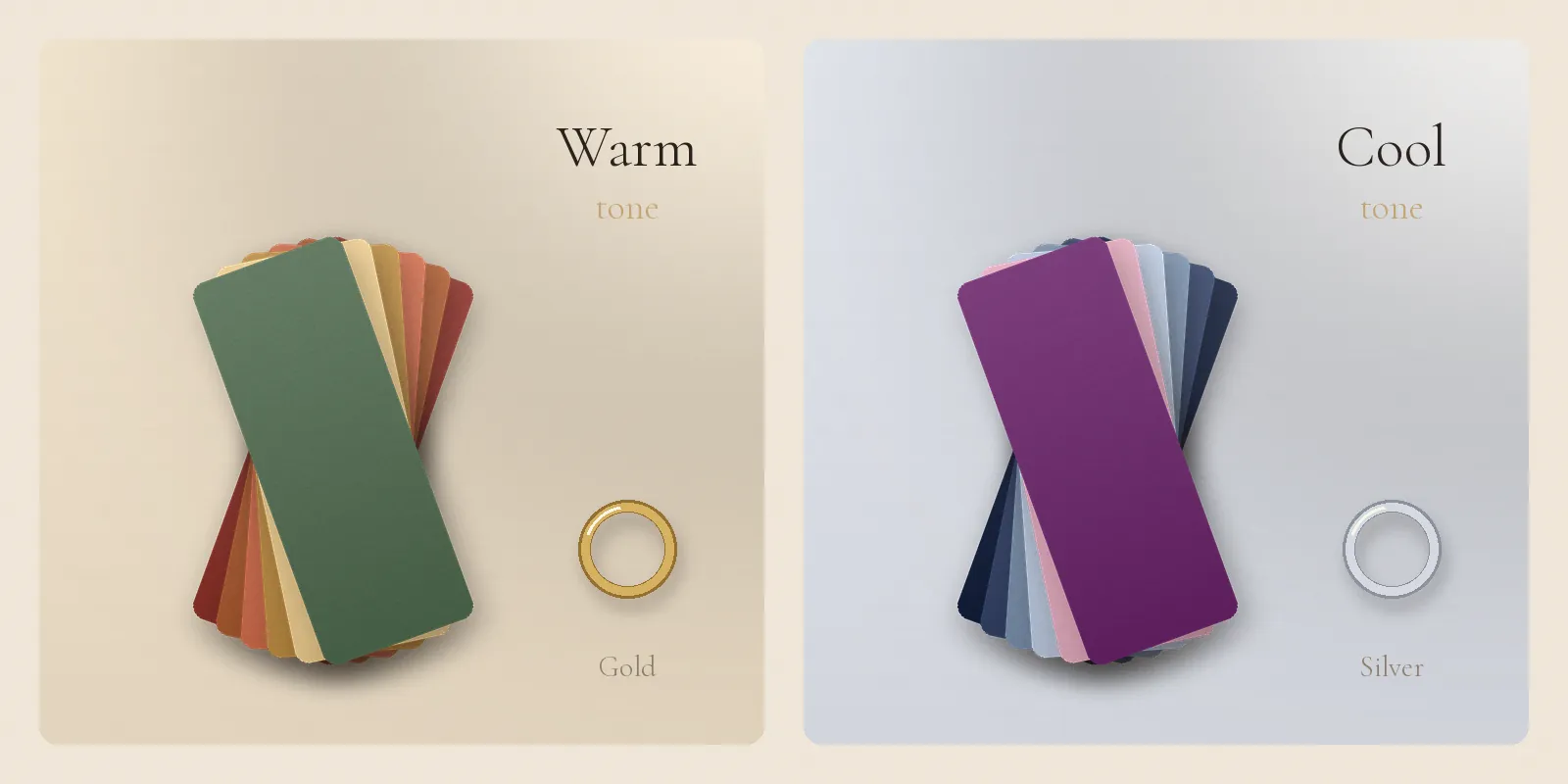
Two people can both wear red: one glows in a yellow-leaning brick red, the other in a blue-leaning cherry. Jewelry works the same way. Gold melts into some skin; silver brightens other faces.
How to read the four seasons
Spring, summer, autumn, and winter are shorthand for combinations of those three axes. Think of the season as a nickname; the qualities behind it matter more than the label.
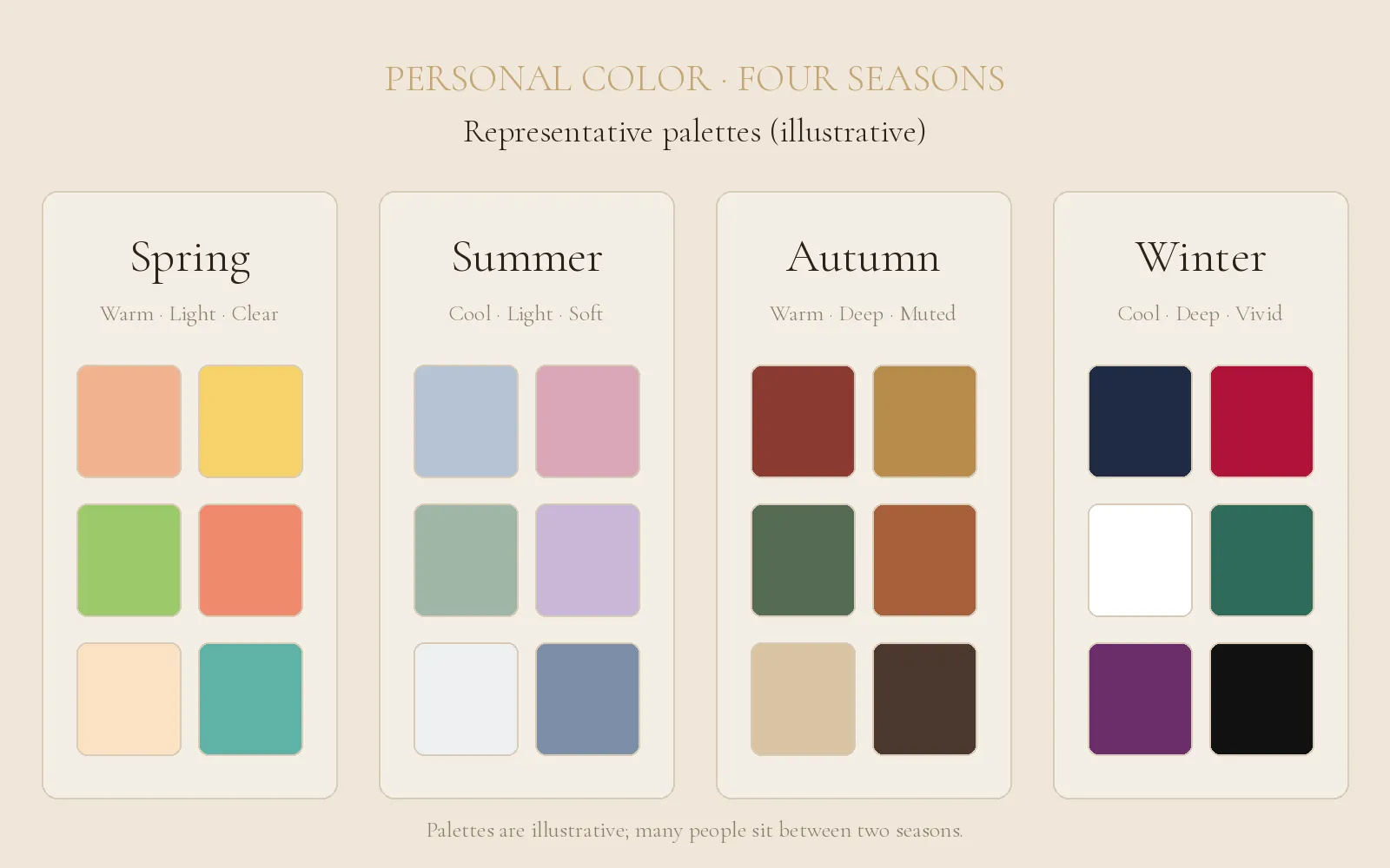
- Spring: warm, light, and clear. Peach, apricot, and fresh green tend to suit.
- Summer: cool, light, and soft. Lavender, rose pink, and powder blue feel at ease.
- Autumn: warm, deep, and muted. Brick, mustard, olive, and camel, like earth and fallen leaves.
- Winter: cool, deep, and vivid. Navy, burgundy, pure white, and black give the face crisp definition.
The season is just a starting point. Many people land somewhere like "mostly autumn, but the darkest shades feel heavy." Rather than forcing yourself into one label, it's more useful to notice which qualities of color bring you forward.
Why lighting and photos change color
Lighting is the most common trap. Under a warm bulb everything looks warmer; under a cool LED everything looks bluer, even with the same skin and the same clothes.
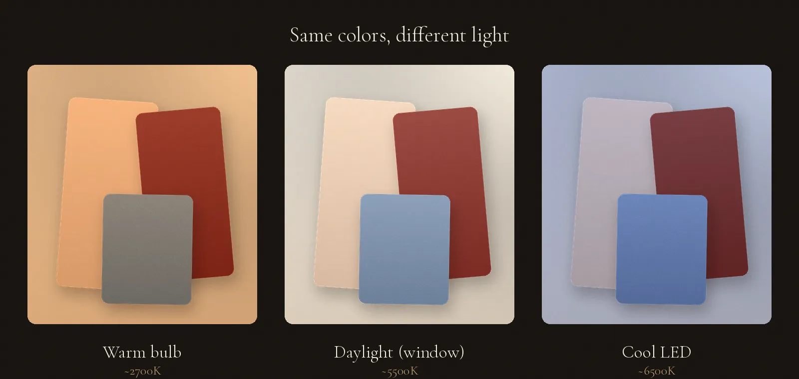
Photos add another layer. Cameras auto-adjust white balance, beauty filters retouch skin tone, and every screen renders color differently. That's why declaring "you are definitely a warm autumn" from a single photo isn't accurate. A photo is a useful first clue, but you still need to hold real colors next to your face.
A simple self-check at home
- Stand by a window in the morning or early afternoon, out of direct sun, ideally without makeup.
- Pull your hair back and cover your clothing with a white towel or T-shirt.
- Alternate gold and silver jewelry near your face.
- Alternate pure white and ivory fabric.
- Note which side makes your skin look clearer and softens shadows and redness.
It's fine if the result is unclear. A self-check only points to a general direction, and your eyes adjust quickly, which makes comparison tricky.
Check your colors with AUBE EDIT
LOOK is free. Sign up, add two photos, and answer a few short questions, and you'll get a story card with your type, four color chips that suit you, and a one-line summary. Your photos are used only to make the card and aren't kept on our servers. LOOK is a first read on your colors, not a final diagnosis, so try the colors on the card in real life.
If LOOK leaves you wanting more, there's BOOK (paid). It works through the colors you've been unsure about and turns them into a detailed 12-page guide on what to buy and what to skip, across makeup, clothing, glasses, and hair color. BOOK is a paid product you can choose after LOOK, whenever you're ready.
At a glance
- Read personal color on three axes: temperature, value, and chroma.
- The seasons are nicknames for those combinations; sitting between two is normal.
- Lighting and photos change color. Don't decide from one photo; compare in daylight.
- Get a first read with free LOOK, and move to paid BOOK when you want to go deeper.